

The Caribbean, with its vibrant landscapes and rich cultural heritage, serves as a profound source of inspiration for interior design, particularly when it comes to creating harmonious living spaces that reflect the essence of this idyllic region. In our exploration of “Caribbean Room-by-Room Color Palettes,” we delve into the intricate interplay of Feng Shui principles, local climate influences, and the pursuit of comfort that is essential for crafting inviting atmospheres in homes. Each room represents a unique opportunity to infuse color and personality while aligning with the natural rhythms of life. By understanding the psychological effects of color, we can create environments that not only enhance aesthetic appeal but also promote well-being and tranquility. This article will guide you through thoughtfully curated color palettes tailored to different spaces within the home—from calming blues in bedrooms that echo the serene waters, to warm earthy tones in living areas that invite connection and conversation. Join us as we embark on a journey to transform your living spaces into sanctuaries that embody the spirit of the Caribbean, ensuring that your home is both beautiful and nurturing, reflecting the harmony of nature and the principles of Feng Shui.
BEDROOM PALETTES (Rest • Cooling • Recovery)
Best Orientation for North / Southwest
Palette A — Cool & Calm
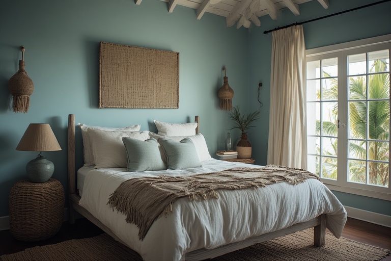
- Walls: Soft blue / pale aqua
- Ceiling: Warm white
- Accents: Driftwood, rattan, soft grey
- Textiles: Linen, cotton (off-white)
Psychology: Lowers heart rate, improves sleep
Why it works here: Feels cooler in humid nights
Palette B — Grounded & Gentle
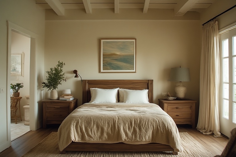
- Walls: Sand / warm beige
- Ceiling: Cream
- Accents: Sage green, light wood
- Textiles: Earth tones
Psychology: Stability + comfort
Best for: Bedrooms with strong sun exposure
LIVING ROOM PALETTES (Connection • Flow • Breeze)
Best Orientation for East / Southeast
Palette A — Indoor–Outdoor Harmony
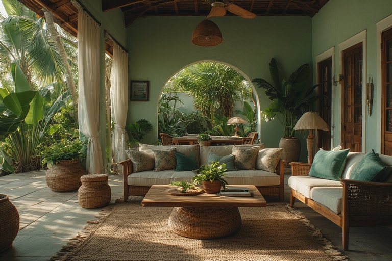
- Walls: Sage green or soft olive
- Ceiling: White
- Accents: Teal, wicker, natural wood
- Plants: Yes (important)
🧠 Psychology: Balance + ease
🌴 Why it works: Blends garden and interior visually
Palette B — Light & Social
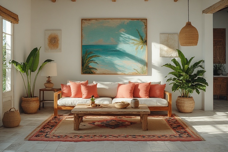
- Walls: Warm white / light greige
- Accents: Coral cushions, art, plants
- Furniture: Natural wood or bamboo
🧠 Psychology: Open, welcoming
🌴 Best for: Homes with verandas attached
KITCHEN PALETTES (Energy • Appetite • Cleanliness)
Best Orientation for East / Southeast
Palette A — Fresh & Functional
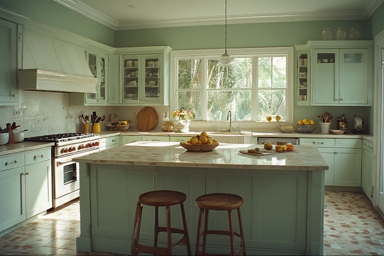
- Walls: Sage green
- Cabinetry: Warm white or light wood
- Counters: Light stone
- Accents: Soft yellow
Psychology: Focus + vitality
Why it works: Feels clean, not hot
Palette B — Bright & Airy
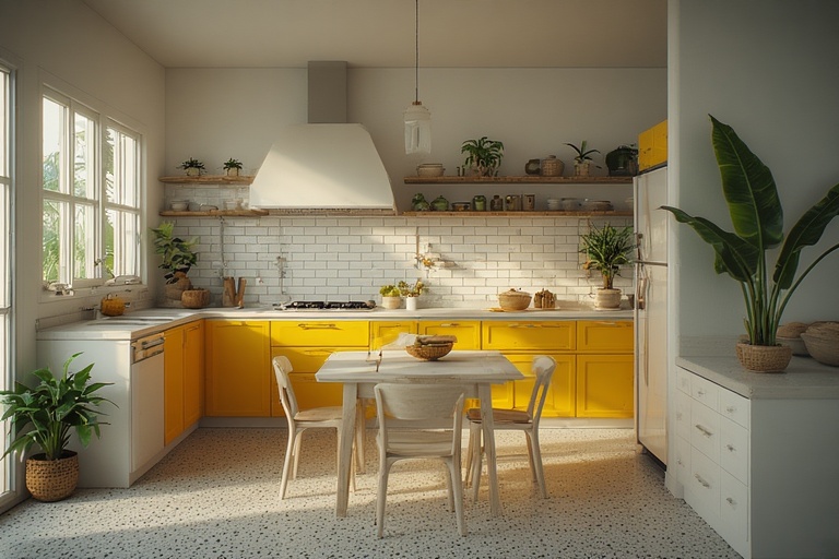
- Walls: Warm white
- Accents: Banana yellow, green plants
- Floor: Cool tile or terrazzo
Psychology: Cheerful + active
Avoid: Dark cabinets (trap heat)
DINING ROOM PALETTES (Connection • Nourishment)
Best Orientation for Southeast / South (softened)
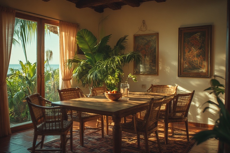
Palette — Warm but Balanced
- Walls: Warm beige or soft clay
- Accents: Muted coral, green plants
- Table: Solid wood
- Lighting: Warm (2700–3000K)
Psychology: Encourages conversation
Key rule: Keep reds muted, never intense
BATHROOM PALETTES (Clean • Cool • Refreshing)
Best Orientation for North
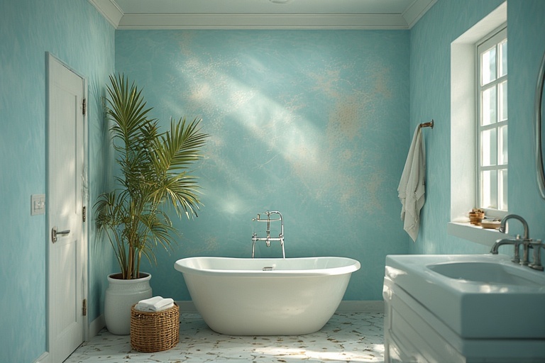
Palette — Water Element
- Walls: Light aqua / misty blue
- Tiles: White or sand
- Accents: Chrome, pale wood
- Textiles: White
Psychology: Clean, calming
Why it works: Feels cooler after sun exposure
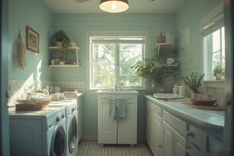
LAUNDRY / SERVICE AREAS (Function • Neutral)
Best orientation for West / Northwest
Palette — Quiet & Practical
- Walls: Light grey or warm white
- Accents: Pale blue or green
- Floor: Non-slip tile
Psychology: Order + clarity
Purpose: Stay visually quiet
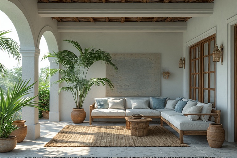
VERANDA / OUTDOOR TRANSITION PALETTES
Best Orientation for West / Northwest / East
Palette — Soft Coastal
- Walls: White, sand, pale grey
- Accents: Blue, green, terracotta pots
- Materials: Wood, bamboo, stone
Psychology: Relaxation + openness
Key: Reflect heat, invite breeze
UNIVERSAL CARIBBEAN COLOR RULE
The Universal Caribbean Color Rule presents a comprehensive framework for understanding the interplay between color, environment, and purpose in the Caribbean context. At its core, orientation establishes the foundational color palette, which is influenced by the natural surroundings and cultural heritage of the region. For instance, coastal areas may lean towards hues that reflect the vibrant blues of the ocean and the sandy tones of the beaches, while inland regions might draw inspiration from the lush greens of the tropical vegetation. This base color not only provides aesthetic appeal but also serves to create a sense of place, establishing a visual identity that resonates with both locals and visitors alike.
Function, on the other hand, introduces the accent colors that enhance the overall design and reinforce the intended use of a space or object. For example, a bustling marketplace may feature bright, energetic accents to evoke a sense of excitement and activity, whereas a serene retreat might incorporate softer, more muted tones to promote relaxation and tranquility.
Additionally, climate plays a critical role in determining the intensity of these colors. In the tropics, the abundant natural light can amplify vibrant shades, making them appear more vivid and dynamic. Thus, the strategic combination of orientation, function, and climate not only influences the aesthetic outcome but also caters to the practical needs of the environment, ultimately ensuring that light—so prevalent in tropical regions—remains the dominant force in the visual narrative.
Common Palette Mistakes
When it comes to interior design, selecting the right color palette is crucial in creating a harmonious and inviting space. Here are common mistakes homeowners make concerninng colour:
- Dark ceilings. While deep hues can add drama and sophistication to a room, they often have the unintended effect of making spaces feel smaller and more enclosed. Instead, lighter ceiling colors can enhance the sense of height and openness, allowing natural light to reflect and brighten the entire area. It’s essential to consider the proportions of the room and how the ceiling color interacts with the walls and furnishings to ensure a balanced aesthetic that promotes an inviting atmosphere.
- Heavy reds, particularly in warmer environments. While red can evoke feelings of warmth and energy, when used excessively in rooms that already experience high temperatures, it can create an overwhelming sense of heat and discomfort.
- Too many bold colors. Having too many bold colors within the same space can lead to visual chaos, detracting from the overall design coherence. It is crucial to establish a focal point or a guiding theme and to use bold colors sparingly, balancing them with neutral tones to create a cohesive look.
- Ignoring the direction of natural light. Different times of day will cast varying light qualities, influencing how colors appear and interact; thus, it is vital to observe how light flows through the space throughout the day before finalizing color choices.
By addressing these common palette mistakes, homeowners can create a more aesthetically pleasing and functional environment.
In conclusion, the thoughtful integration of color palettes in Caribbean room design not only enhances aesthetic appeal but also aligns with the principles of Feng Shui, climate considerations, and overall comfort. By selecting hues that resonate with the vibrant Caribbean environment and promote a sense of tranquility, homeowners can create spaces that foster positivity and well-being.
Below are clean, visual swatch cards you can use for your next project. Click on the link to download.
The Caribbean Room-by-Room Color Swatch Cards (PDF)
LATEST ARTILCES
-

10 Ideas designed for a Caribbean Tropical Home
These ideas are designed for a Caribbean tropical home, where the emphasis is on natural materials, breezy spaces, vibrant foliage, and seasonal changes that fit the local climate rather than four distinct temperate seasons. 1. Tropical Spring Refresh To create a refreshing ambiance in a Caribbean tropical home, the concept of a “Tropical Spring Refresh”…
-

How to Make Your Own Bubble Diagram
A bubble diagram in architecture is a quick, loose way of planning how spaces relate to each other before you start drawing walls, doors, or exact dimensions. Think of it as the logic underneath the floor plan. Instead of drawing a bedroom as a precise 12′ × 14′ rectangle, you draw a bubble labelled Bedroom.…
-
Remedies for Slopes, Corners & Sharp Angles
In the realms of architecture and feng shui, a significant overlap exists in their fundamental principles, despite the different terminologies used. Feng shui emphasizes the concept of “chi,” which refers to the vital energy that flows through spaces, affecting the well-being of individuals. Architects, on the other hand, focus on aspects such as circulation, sight…