

Colour psychology is a fascinating field that delves into the intricate relationship between hues and human emotions, behaviors, and perceptions. As an essential element of visual communication, colour influences our experiences in profound ways, often operating beneath our conscious awareness. From the warm tones of red and orange that evoke feelings of excitement and warmth, to the calming shades of blue and green that promote tranquility and relaxation, colour plays a pivotal role in shaping our responses to the world around us. In design and art, the deliberate use of colour can convey messages, set moods, and evoke memories. This article explores the fundamental principles of color psychology in home design and how color choices can make rooms feel cooler, calmer, larger, more social, or more restful without changing a single wall.
WHAT IS COLOR PSYCHOLOGY?
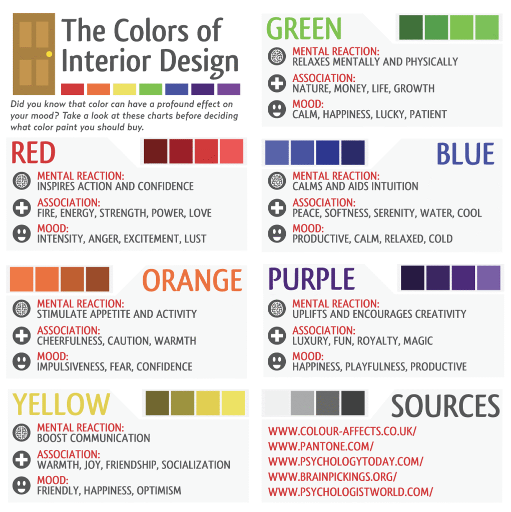
Color psychology is how the brain and nervous system respond to color. Colors influence energy levels, relaxation, appetite, focus, temperature perception, and sense of space. You feel color before you think about it. For instance, vibrant warm colors like red and orange can elevate energy levels and stimulate feelings of excitement and enthusiasm, while cooler tones such as blue and green tend to evoke calmness and tranquility. This interplay between color and emotion highlights the powerful role that color plays in our daily lives, influencing aspects as varied as our appetite, concentration, and even our perception of temperature and space.
Moreover, the impact of color extends beyond mere emotional response; it can significantly affect our decision-making processes and behavioral patterns. In marketing and branding, for example, companies strategically utilize specific colors to elicit desired reactions from consumers, thereby driving engagement and sales. Similarly, in interior design, the choice of colors in a space can create an atmosphere that encourages relaxation or productivity, depending on the intended purpose of the environment. Ultimately, understanding color psychology allows individuals and organizations to harness the profound effects of color, enabling them to create environments and experiences that resonate deeply on an emotional level. As such, color is not just a visual element; it serves as a powerful tool for influencing our mental and emotional landscape, often before we even have the chance to articulate our feelings.
HOW COLOR AFFECTS SPACE (VISUALLY & EMOTIONALLY)
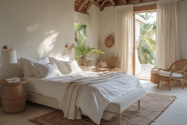
Light colors play a crucial role in interior design and architecture by creating a sense of openness and airiness within a space. These hues, which range from soft pastels to bright whites, reflect natural and artificial light, thus enhancing the overall brightness of a room. This reflective quality not only makes spaces feel larger and more expansive, but it also contributes to energy efficiency by reducing the need for artificial lighting during daytime hours. Furthermore, light colors are known to have a calming effect on the nervous system, promoting a sense of tranquility and peace. This psychological benefit makes them particularly suited for spaces designed for relaxation and rejuvenation, such as bedrooms and wellness areas.
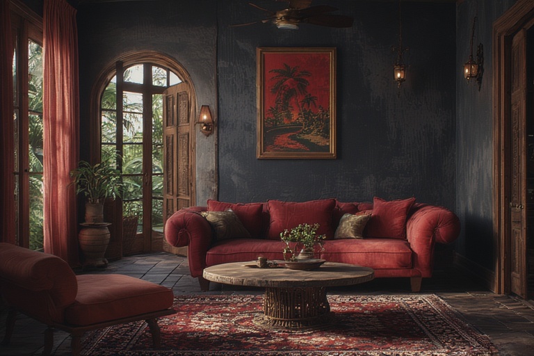
In contrast, dark colors can impart a sense of coziness, grounding, and intimacy to a space. These deeper hues, which include rich shades of navy, charcoal, and burgundy, absorb both light and heat, creating a warm and inviting atmosphere. While dark colors can add depth and sophistication to a room, their use should be approached with care; they are best employed in moderation or within shaded rooms to prevent feelings of confinement or heaviness. When strategically applied, dark colors can provide a striking contrast to lighter elements, enhancing the overall aesthetic and creating a visually dynamic environment. Balancing the use of light and dark colors can ultimately elevate the design of a space, fostering both functionality and emotional well-being.
🌈 CORE COLOR EFFECTS IN HOME DESIGN
Blue
The color blue is often associated with a sense of calmness and tranquility, making it a popular choice in various interior design applications. Psychologically, blue has been shown to lower stress levels, promote relaxation, and even slow down heart rates. This soothing effect can create a peaceful atmosphere in any space, allowing individuals to unwind and recharge. The cool undertones of blue can also evoke feelings of spaciousness, making rooms appear larger and more open. As such, blue is particularly well-suited for areas where relaxation and comfort are paramount, such as bedrooms, living rooms, and bathrooms.
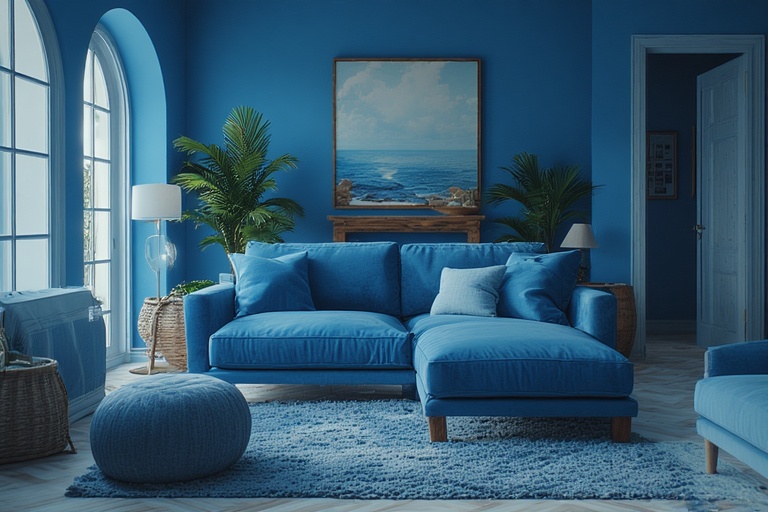
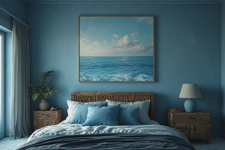
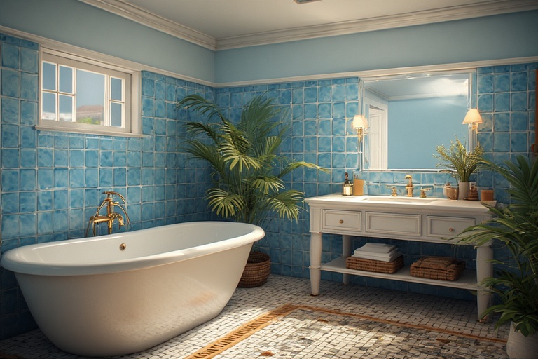
In regions characterized by heat and humidity, such as the Caribbean, the strategic use of soft blue tones can yield significant psychological benefits. These light, airy shades can help counteract the oppressive heat often felt in such climates by creating an illusion of coolness and freshness within the living space. By incorporating soft blues into the design of homes or resorts, individuals can not only enhance the aesthetic appeal of their environment but also foster a more comfortable and inviting atmosphere. Ultimately, the thoughtful application of blue in interior design can significantly contribute to one’s overall well-being, making it a valuable consideration in both residential and commercial spaces.
Green
The color green is often associated with balance, healing, and the natural world, making it an ideal choice for various spaces within a home or workplace. From psychological perspectives, green is known to have restorative qualities that can promote a sense of calm and tranquility. Its soft, refreshing tones are easy on the eyes, providing a visual respite that encourages relaxation and mental clarity. As a color that embodies equilibrium, green can help create environments that foster harmony, making it particularly suited for living areas, bedrooms, and studies where individuals seek both comfort and focus.
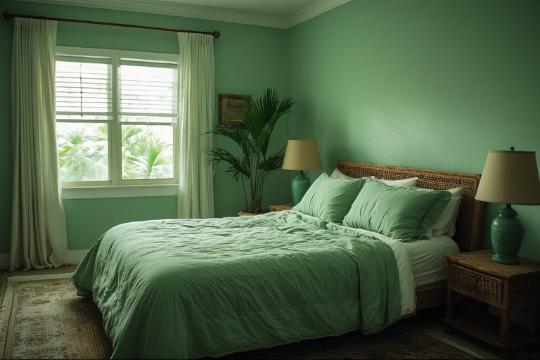
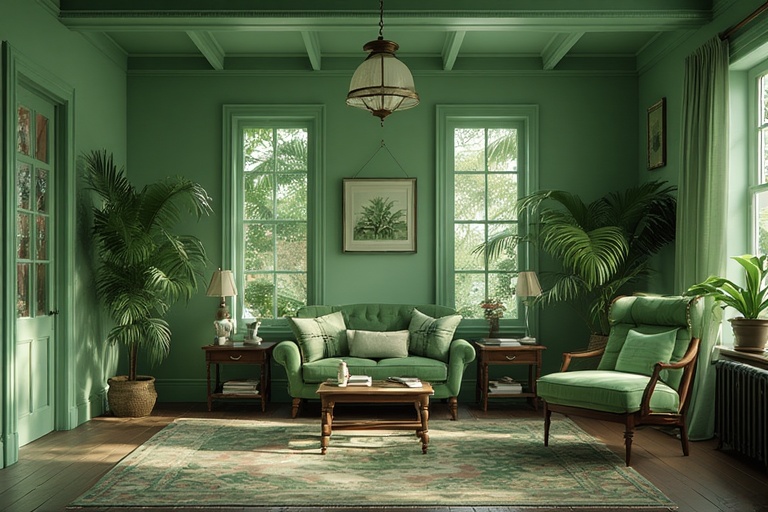
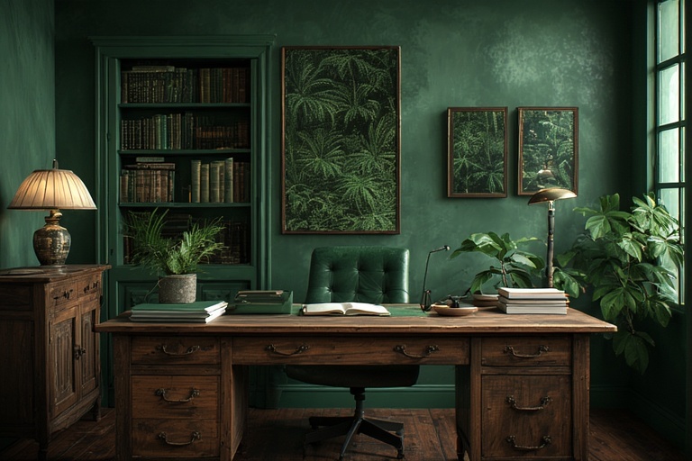
Incorporating green into interior design not only enhances the aesthetic appeal of a space but also serves as a powerful reminder of the connection between indoor environments and the lush landscapes outside. A Caribbean tip for utilizing green effectively is to strategically place plants and greenery within living spaces, blurring the lines between the indoor and outdoor realms. This practice not only brings the refreshing essence of nature indoors but also promotes a sense of well-being and serenity. By thoughtfully integrating various shades of green into home decor, individuals can cultivate spaces that are not only visually pleasing but also conducive to emotional and mental healing.
Yellow
Yellow is a color that embodies lightness, optimism, and warmth, making it a powerful choice in interior design. Psychologically, yellow has been shown to stimulate mood and foster a sense of joy and positivity. It promotes communication and encourages conversation, making it an ideal color for social spaces. Additionally, yellow has the unique ability to increase appetite, which is why it is often favored in kitchens and dining areas. When used effectively, yellow can create an inviting atmosphere that enhances the overall experience of a home.
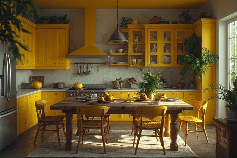
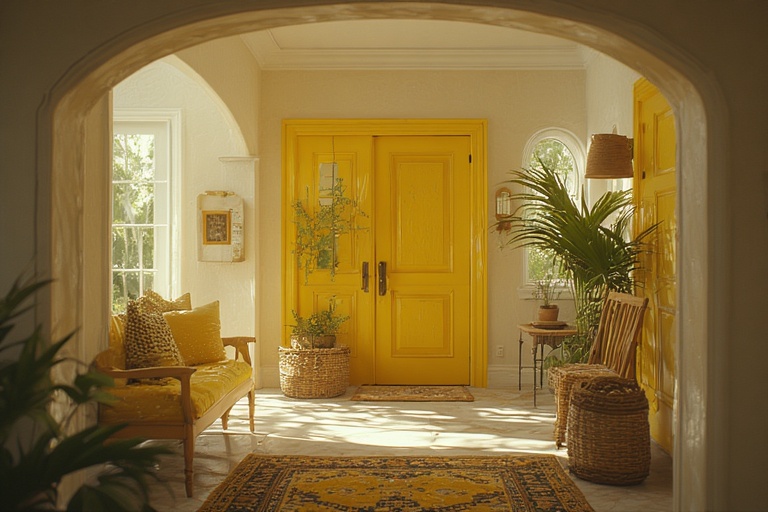
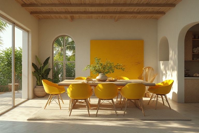
However, it is important to use yellow judiciously, as an overabundance of bright yellow can lead to feelings of restlessness and agitation. To achieve a balanced aesthetic, consider incorporating softer shades of yellow or pairing it with complementary colors that can help to ground the space. In entryways, yellow can serve as a cheerful welcome, setting a positive tone for anyone who enters. By understanding how to harness the power of yellow thoughtfully, homeowners can create environments that not only uplift spirits but also foster connection and warmth among family and friends.
Red
The color red is often associated with vibrant energy, intense passion, and a robust appetite. Psychologically, it has the unique ability to elevate energy levels, making it an ideal choice for spaces designed to foster interaction and enthusiasm. When incorporated into a room’s design, red stimulates the appetite, which is why it is frequently used in dining areas and restaurant settings. This dynamic hue also enhances the perception of warmth in a space, creating an inviting atmosphere that encourages social engagement and conviviality. Its stimulating properties make it particularly effective in areas where people gather, fostering a sense of excitement and connection among individuals.
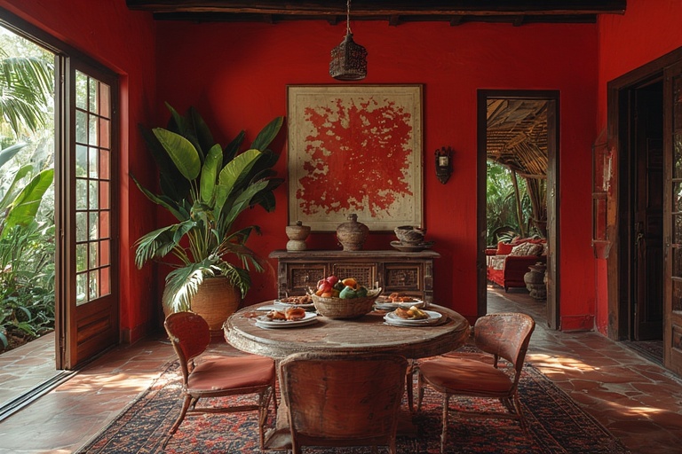
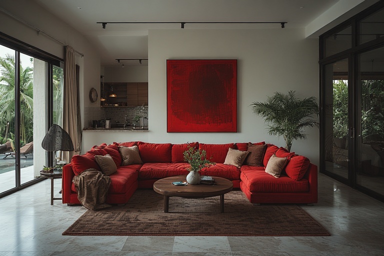
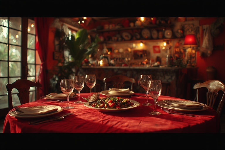
However, despite its numerous benefits, red should be used judiciously to avoid overwhelming a space. It is best suited for accents in dining rooms or social areas where its energizing qualities can be fully appreciated without dominating the environment. In contrast, it is advisable to avoid using red in bedrooms or on large wall areas, especially in hot climates, as it can contribute to a sense of restlessness and discomfort. In such settings, cooler colors may be more appropriate to create a calming oasis for relaxation and sleep. By thoughtfully considering the placement and context of red, designers can harness its powerful emotional effects while maintaining a balanced and harmonious environment.
White
In the realm of interior design, the use of white and neutral tones is highly regarded for their ability to create an atmosphere of calmness, cleanliness, and reflection. These colors are not merely aesthetic choices; they also hold significant psychological benefits. The clarity that white and neutral shades provide can enhance mental focus and promote a sense of tranquility in living spaces. This is particularly important in areas where individuals seek solace or need to concentrate, as the absence of overwhelming colors fosters an environment conducive to relaxation and productivity. Furthermore, these hues can create an impression of spaciousness, making even small areas feel more open and inviting, which is especially beneficial in urban settings where square footage is at a premium.
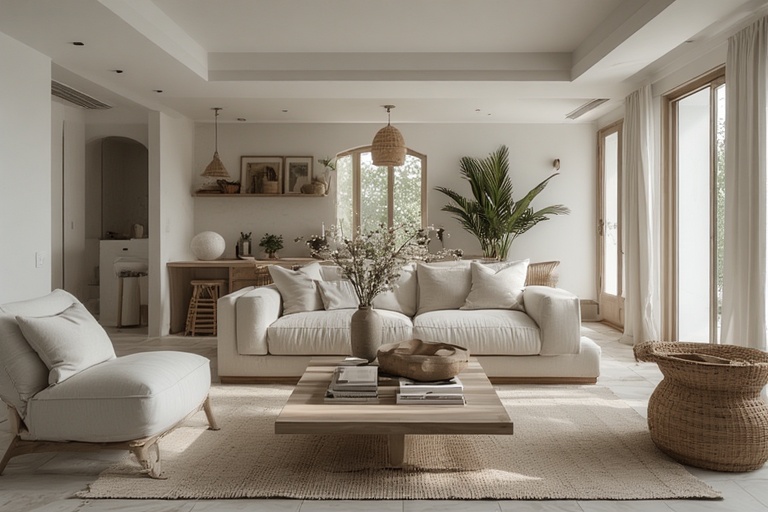
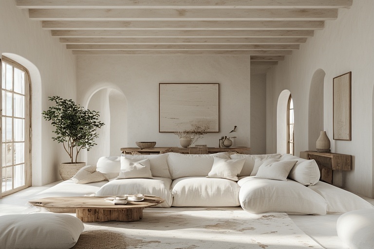
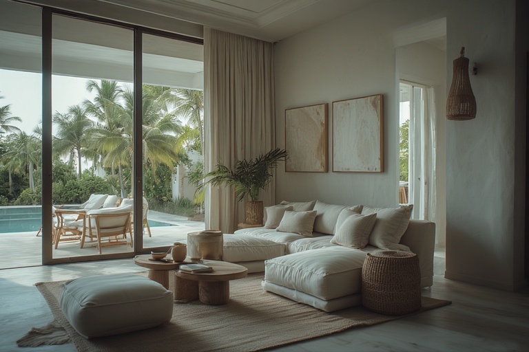
When considering the application of white and neutral colors in a home, they serve as an ideal base for the entire house. These shades can be effectively utilized across various surfaces, including walls, ceilings, and even smaller rooms, establishing a cohesive flow throughout the living space. Additionally, a Caribbean-inspired tip for homeowners is to opt for warm whites, which can help mitigate glare and prevent the harshness that often accompanies brighter, cooler whites. This approach not only enhances the aesthetic appeal of a room but also contributes to a more comfortable and welcoming ambiance, allowing residents to fully enjoy their environment while drawing upon the foundational benefits that these colors inherently offer.
Earth Tones
Earth tones are characterized by their warm, natural hues that evoke a sense of grounding and stability. These colors, which include shades of browns, greens, and muted yellows, are often associated with the earth itself, fostering feelings of comfort and safety. From a psychological perspective, earth tones can create an environment that feels nurturing and secure, as they often remind individuals of natural landscapes and the outdoors. This connection to the land not only promotes tranquility but also enhances one’s sense of belonging and rootedness in their surroundings. Such colors can be particularly effective in spaces designed for relaxation or reflection, allowing individuals to unwind and feel at home.
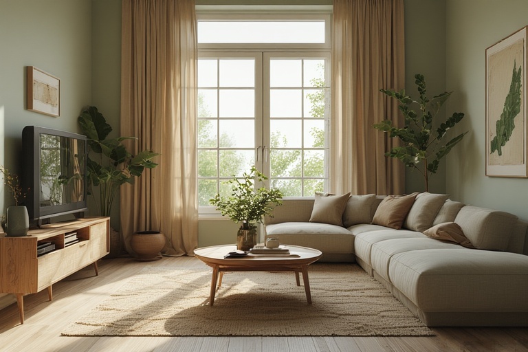
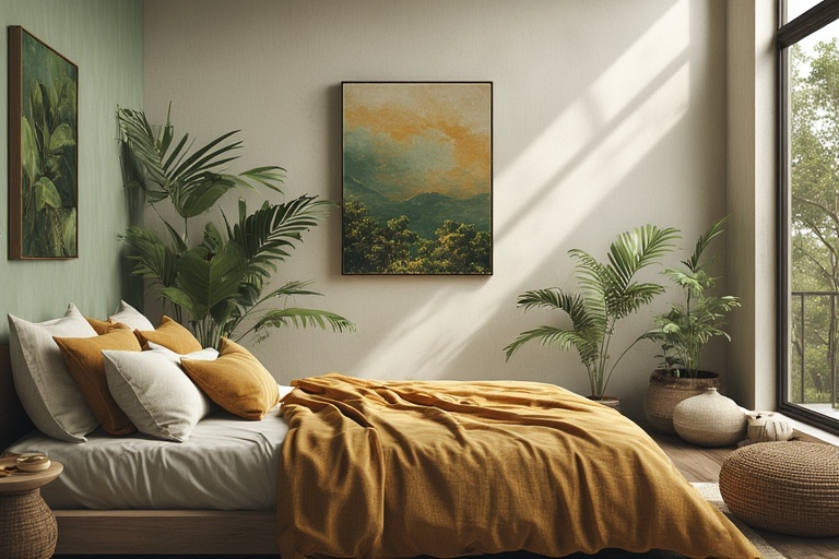
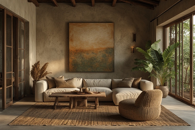
In interior design, earth tones are versatile and can be utilized in various applications to enhance the aesthetic and emotional impact of a space. They are particularly well-suited for flooring, as warm browns or soft greens can provide a serene foundation that complements other decor elements. Furniture pieces in these shades not only contribute to a cohesive look but also invite comfort and warmth into the room. Additionally, accent walls painted in earth tones can serve as focal points that draw the eye while maintaining an overall sense of harmony within the space. By thoughtfully incorporating earth tones into design choices, one can create an environment that feels both inviting and grounded, ultimately promoting a deep sense of well-being and connection to the natural world.
COLOR BY ROOM: A PRACTICAL GUIDE
When selecting colors for your interior spaces, it is essential to consider the unique purpose and atmosphere that each room is intended to convey. In the bedroom, colors such as soft blues, gentle greens, and warm neutrals are particularly effective in creating a tranquil environment conducive to rest and recovery. These hues promote a sense of calmness, allowing individuals to unwind after a long day. Conversely, it is advisable to avoid intense reds or bright yellows in this space, as these colors can evoke feelings of excitement and energy that may disrupt the overall serenity and peace desired in a sleeping area.
In the kitchen, the color palette should be invigorating yet comforting, with soft yellows, sage greens, and warm neutrals serving as excellent choices. These shades not only enhance the inviting nature of the space but also help to maintain a sense of warmth without overwhelming the senses. It is crucial to steer clear of dark, heavy colors that can absorb light and create a stifling atmosphere. The living room, a central hub for connection and relaxation, benefits from the use of greens, blues, and warm neutrals, with accent colors that reflect personal style and character. Finally, in the bathroom, light blue, aqua, white, and sand tones can create a clean and cooling ambiance, promoting a refreshing and rejuvenating experience, perfect for daily routines. By thoughtfully choosing colors for each room, you can significantly enhance the overall aesthetic and functionality of your living environment.
Caribbean-Specific Color Psychology: A Comprehensive Overview
The psychology of color in the Caribbean context is deeply intertwined with the region’s unique climate and cultural identity. In this vibrant environment, the perception of heat is significantly influenced by color choices. Light colors, such as soft whites, pastels, and pale blues, tend to evoke a sense of coolness, creating a more comfortable atmosphere in homes, particularly in the absence of air conditioning. Conversely, darker colors absorb more heat, contributing to a warmer sensation that can detract from comfort levels. This understanding of heat perception is essential for Caribbean homeowners and designers who seek to create inviting and livable spaces that promote relaxation and well-being in a tropical climate.
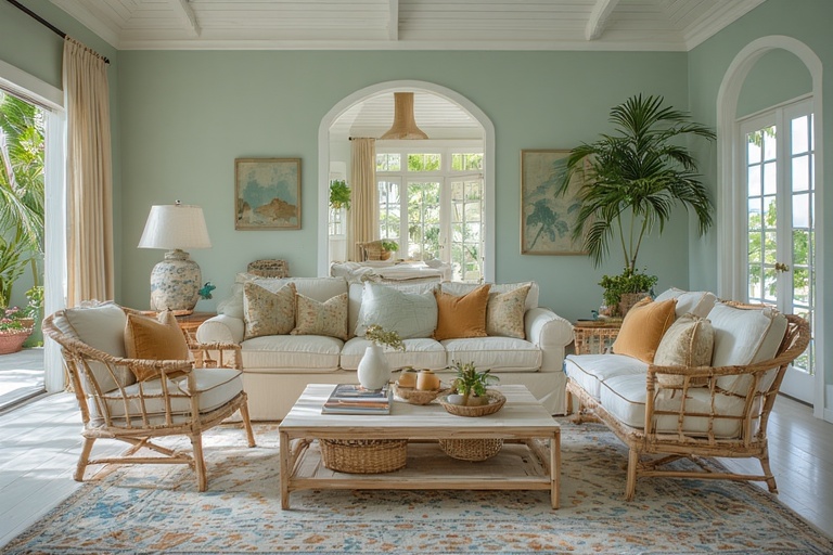
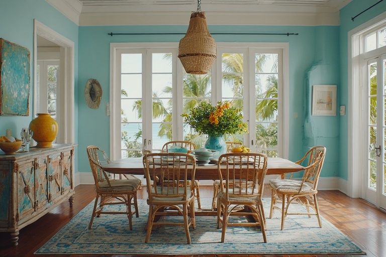
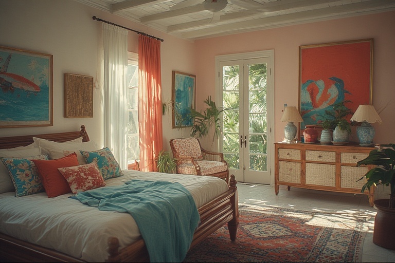
Moreover, the integration of color in Caribbean interiors extends beyond mere aesthetics; it serves as a crucial element in fostering indoor-outdoor flow. Utilizing a palette that incorporates greens, sandy tones, and shades of blue not only minimizes visual boundaries but also enhances the perception of space, making homes feel larger and more open. This approach encourages a seamless transition between indoor living areas and outdoor verandas, which are essential for socializing and enjoying the natural surroundings. Furthermore, color in Caribbean homes is often employed as a means of cultural expression, where bright accents are juxtaposed against neutral bases. This dynamic interplay of colors, combined with the use of natural materials, creates a harmonious balance, allowing residents to celebrate their heritage while cultivating an environment that radiates joy and vibrancy.
SIMPLE COLOR STRATEGY THAT ALWAYS WORKS
The 60–30–10 rule is a time-tested color strategy that serves as an effective guideline for achieving a harmonious and visually appealing interior design. The core principle of this approach involves dividing the color palette into three distinct proportions: 60% neutral tones for the base, 30% secondary colors for furnishings, and 10% accent colors for decorative elements. This foundational structure ensures that the neutral base, typically represented by the walls, creates a calming backdrop that establishes a cohesive atmosphere. By utilizing a dominant neutral color, designers can set the stage for the remaining elements, allowing them to complement without overwhelming the senses.
Incorporating the 30% secondary color into furniture pieces adds depth and character to the space, bridging the gap between the neutral backdrop and the vibrant accents. This secondary color is pivotal in creating balance and interest, ensuring that the room feels inviting rather than chaotic. Finally, the 10% accent color serves as the finishing touch, bringing energy and personality to the overall design. Whether through art, cushions, or plants, these vibrant touches enliven the space and draw the eye, preventing visual fatigue and chaos. By adhering to the 60–30–10 rule, designers can create environments that are not only aesthetically pleasing but also functional and comfortable.
COMMON COLOR MISTAKES
When it comes to interior design, selecting the right color palette can significantly influence the ambiance and functionality of a space. One common mistake is the use of overly bold colors without considering their impact on the overall environment. While vibrant hues can energize a room, an excessive application can lead to visual chaos and emotional fatigue. It is essential to strike a balance by incorporating bold colors as accents rather than overwhelming the space. Additionally, the choice of color should take into account the purpose of the room. For instance, a tranquil bedroom may benefit from softer tones to promote relaxation, while a lively kitchen could embrace brighter shades to enhance creativity and activity.
Another prevalent error in color selection is neglecting the effect of natural light and the orientation of rooms. Dark ceilings in rooms that receive ample sunlight can create an uninviting atmosphere, making the space feel smaller and less welcoming. Instead, lighter ceiling colors can help reflect light, creating an airy and open feel. Furthermore, designers often fall into the trap of replicating trendy magazine palettes without considering local climate conditions. For example, a color scheme that works beautifully in a cooler, temperate region may not translate well in warmer, sun-drenched locales. It is crucial to tailor color choices not only to personal preferences but also to the environmental context, ensuring a harmonious and comfortable living space.
CONCLUSION
In conclusion, the strategic use of color in the Caribbean transcends mere aesthetics; it plays a vital role in enhancing the overall well-being of residents and the environment. By thoughtfully selecting color palettes, homeowners can create cooler living spaces, promote restful sleep, alleviate stress, encourage outdoor activities, and even contribute to energy efficiency. Understanding color as an integral element of environmental psychology underscores its potential to not only beautify homes but also to foster healthier, more sustainable lifestyles in the vibrant Caribbean context. As we embrace this knowledge, we can harness the power of color to enrich our daily lives and the communities we inhabit.